
As a group, we came up with our own production team, 'MELLIE PRODUCTIONS'. As a group we developed our ancillary packages and produced and directed our music video, to our song ' Gone' by 90's boy band N'SYNC. However in the actual music industry separate companies would be responsible for each individual product involved in the package, one company would not manufacture all three of these products.
In the actual Music Industry a company such as Epik Music Videos who direct, edit and film Music Videos, Behind The Scenes Documentaries and Event Filming. Epik Music Videos, mainly appeal to young, up and coming directors. Below is an example of a video made by Epik Music Videos.
Epik Music videos, say they are always looking for new talent to work with, the price of around £1,500 is expected to be paid to Epik Music Videos, in order for them to direct, edit and film the music video. With most companies firstly you send them the track you want the music video to be produced for, and any ideas or storyboards you may have. After you have done this they will then arrange to get in touch with you in some way, whether it be on the phone or in person, and talk about locations and final budget.
You will then sit down with the company and arrange a budget, in which you will stick to when buying props and scouting locations, and when considering aspects of special effects. The budget is generally the most important aspect to consider when making a music video, it will help decide what your video can contain, normally the higher the budget the better quality your video will be, as you have more chance of gaining more special effects and higher quality of props, and maybe able to rent out certain locations, which you may not be able to do with a low budget.
After you have chosen your budget, you will then look around for locations to film scenes of your music video, a variety of locations are always useful and important way of making the audience more entertained rather than staring at the same location for the full 3-4 mins of the song.
After this the shoot will then take place, when all the planning, and call sheets and story boards are correct and finalised. After the shoot, editing will commence and a rough cut will be produced, this could then be placed on Youtube, or shown to an audience where you will then receive feedback leading to another possible rough cut. This will then carry on happening until everyone is happy with the cut making it a final cut.

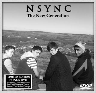
Below is our final Digipak front and back covers :

The third part of our package is a Magazine Advert, this part is vital for the sell of your Digipak and Video. They can promote them seperatly with no real connection or they can sell them as a package, as the Mag ad may include something about the special features involved in the Digipak.
Magazines are a very good way of advertising promotions like this as they are regualry bought by people, who will have families, they are then left around the house or passed on around an office for other people to read meaning more generations can look at them. Magazines are often a long read, and people read them in two parts, making it clear the mag ad will be seen.
A company such as Maa Designs, could possibly design the Magazine Advertisement. Maa design in many forms including Brochures, Advertising, Posters and many more. Their designs can include 2D and 3D images placed on them.
When designing ours we kept some things similar such as :
- We kept the locations used in the video, and picture taken for the Digipak the same. The location from the video, Ilkley Moors was used for the Digipak, front and back cover. We used a country/ rural location so we could stick to the typical conventions of music video. Also by using the Moors, as our front/back panels images, we clearly linked the fact that our music video was the main focus of our digipak.
- We have used a similar from behind pose, on the bench for our mag ad and back panel of the digipak, this clearly links the mag ad and digipak, however the color scheme is different , we have used color on the Mag Ad.

- We have used flowers for the inside of our digipak, which links in with our narrative as we have shown Charlie our lead male for the narrative picking up flowers and placing them on the grave. We have also layered in Sophie and Charlie for the inside of the digipak, they are dressed in the clothes shown in a flashback shot.
- The digipak is in black and white, we chose this in order to link the digipak to the narrative of the music video, as most of the flashbacks are in black and white. We also chose this so the design was different to the original digipak made for the song originally.
Below is the Original Digipak ' N'sync - ' gone '


- The outfits worn in music video by the Boy band, are also worn in the Digipak, you can also faintly see the clothes are similar in the Mag Ad.
- For the inside panels of our digipak as well as having Sophie and Charlie layered in we have placed the boy bands heads, one in each petal which were placed in each corner. This clearly links are two narrative leads with the band, and also with the music video, which you can see below :

We Also Kept Some Things Different :


- The Mag Ad mainly includes, white colour font writing, compared to our Digipak where we used an equal amount of both, we did to begin with want to have the Mag Ad font colour White and the Digipak Black to try show a clear difference, however during planning this changed, as due to the background images some colours were more visible.
- Our first teaser of the Mag Ad was done in black and white, however we soon changed this for the real thing, and had it in colour. We chose to do the teaser in black and white, as we didn't want to show the full potential of the Mag Ad to audiences, as it was only a teaser.
As seen below you can clearly see the differences :
Teaser Final Draft

- The location between the digipak and the magazine advert are different, the Digipak being on the Moors and the Mag Advertisment being at the memorial in Ilkley. We chose the memorial, as it links to the idea of our lead girl being dead, which we discover at the end of the video.
- Also the Mag Ad is mainly focused on the band, so doesn't involved any of the narrative, so doesn't really tie in with the music video, compared to the digipak.
- The fonts style used on the digipak and magazine advert are different to each other, the N'SYNC is more bold on the Mag Ad compared to the digipak,however they are the same colours, the ' New Generation', on the Mag Ad is also more prominant and larger than what it is on the Digipak, with a more bold font, to make the name of the Digipak stand out more, also on the Mag advert this is placed in the colour of white, where as it is black on the digipak.
No comments:
Post a Comment
All comments are moderated please be appropiate