A2Vid2012-Ellie F
Welcome to my A2 blog, this will feature Research, Planning and Progress towards my final edit of N'sync Gone Music Vid and the 2 ancillary texts. The blog will also feature our Evaluation of our final piece. Feel free to leave criticism :)
Tuesday, 1 May 2012
Final Cut - N'SYNC - ' Gone '
This our final cut of N'SYNC hit song ' Gone ' from 2001. After many problems including casting and locations, and weather issues we have finally managed to create our final music video. We have used effects such as Vignette, and added various amounts of layering. Hope you enjoy this. Comments welcome.
Monday, 30 April 2012
Evaluation Q1 - In What Ways Does Your Product Use, Develop or Challenge Forms And Conventions Of Real Media Products ?
Due to difficulties the beginning of my Typical Conventions Of Music Video has been cut of the beginning of the video.
The Beginning Of My Typical Conventions Used In Music Video Are :
The Beginning Of My Typical Conventions Used In Music Video Are :
- Layering is often used in Music Video, this is often used a very good effect, mainly when trying to portray either flashbacks or multiple people in one shot an example of this is Pass Out by - Tini Tempah.
- There are often 3 types of Music Video, this was introduced by Goodwins Theory : Narrative is where the lyrics to the songs directly linked to what we see on the screen. Performance is where the artist or band are performing in the video, although it doesn't always have to be the artist in particular singing in the video, it could be an actor or an actress lip syncing, an example of this is Nickelback ( Rockstar ).
- Another type is concept, this is where the video does not relate to lyrics in any way.
In most videos though, there is normally a mix between at least two of the types of music video, an example of a mix between narrative and performance is Professor Green Featuring Emelie Sande - Read All About It. The video cuts between shots of performance in abandoned warehouse and narrative, where we have shots of him as a young boy and we see his relationship with his family and his dad, which is a direct link to the lyrics.
.
- Shot variation is often used, in order to keep the audience interested.
- Different locations are often used, however an example of where this is challenged is Bruno Mars - The Lazy Song.
- Linear and Non Linear concepts are often common conventions, and so are titles and various special effects.
Evaluation Q 2 - How Effective Is The Combination Of Your Main Products And Ancillary Texts?
Our coursework task was to produce a package which included, a Digipak, a Magazine Ad promoting the Digipak, a Music Video for a DVD to be placed into the Digipak.
As a group, we came up with our own production team, 'MELLIE PRODUCTIONS'. As a group we developed our ancillary packages and produced and directed our music video, to our song ' Gone' by 90's boy band N'SYNC. However in the actual music industry separate companies would be responsible for each individual product involved in the package, one company would not manufacture all three of these products.
In the actual Music Industry a company such as Epik Music Videos who direct, edit and film Music Videos, Behind The Scenes Documentaries and Event Filming. Epik Music Videos, mainly appeal to young, up and coming directors. Below is an example of a video made by Epik Music Videos.
Epik Music videos, say they are always looking for new talent to work with, the price of around £1,500 is expected to be paid to Epik Music Videos, in order for them to direct, edit and film the music video. With most companies firstly you send them the track you want the music video to be produced for, and any ideas or storyboards you may have. After you have done this they will then arrange to get in touch with you in some way, whether it be on the phone or in person, and talk about locations and final budget.
You will then sit down with the company and arrange a budget, in which you will stick to when buying props and scouting locations, and when considering aspects of special effects. The budget is generally the most important aspect to consider when making a music video, it will help decide what your video can contain, normally the higher the budget the better quality your video will be, as you have more chance of gaining more special effects and higher quality of props, and maybe able to rent out certain locations, which you may not be able to do with a low budget.
After you have chosen your budget, you will then look around for locations to film scenes of your music video, a variety of locations are always useful and important way of making the audience more entertained rather than staring at the same location for the full 3-4 mins of the song.
After this the shoot will then take place, when all the planning, and call sheets and story boards are correct and finalised. After the shoot, editing will commence and a rough cut will be produced, this could then be placed on Youtube, or shown to an audience where you will then receive feedback leading to another possible rough cut. This will then carry on happening until everyone is happy with the cut making it a final cut.
One part of our Ancillary texts was a Digipak which is a style of CD or DVD packaging, they typically consist in the form of a book- style paperboard or card stock outer binding, with one or more plastic trays capable of holding a CD or DVD attached to the inside, sometimes they can include pull out lyrics sheets.
A company such as WeWow, would be the company to make digipak. Similar to the music video an artist will go to the company, with a design or a template of what they want the Digipak to look like, and what they want it to include, a budget will also be decided again.This then allows the company to produce something ideal for the artist/band. WeWOW are in good connections with Amazon, helping you sell your product.
Below is our final Digipak front and back covers :
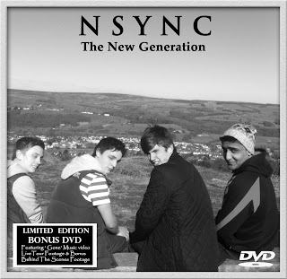

The third part of our package is a Magazine Advert, this part is vital for the sell of your Digipak and Video. They can promote them seperatly with no real connection or they can sell them as a package, as the Mag ad may include something about the special features involved in the Digipak.
Magazines are a very good way of advertising promotions like this as they are regualry bought by people, who will have families, they are then left around the house or passed on around an office for other people to read meaning more generations can look at them. Magazines are often a long read, and people read them in two parts, making it clear the mag ad will be seen.
A company such as Maa Designs, could possibly design the Magazine Advertisement. Maa design in many forms including Brochures, Advertising, Posters and many more. Their designs can include 2D and 3D images placed on them.
This shows that not all products are made together , they are all produced separately, however with the artists having a brief idea of what they want on the Digipak and Mag Advertisement, and if they Mag Ad is advertising the video and Digipak, there has to be some form of similarities, however they do not necessarily be linked design wise.
When designing ours we kept some things similar such as :


As a group, we came up with our own production team, 'MELLIE PRODUCTIONS'. As a group we developed our ancillary packages and produced and directed our music video, to our song ' Gone' by 90's boy band N'SYNC. However in the actual music industry separate companies would be responsible for each individual product involved in the package, one company would not manufacture all three of these products.
In the actual Music Industry a company such as Epik Music Videos who direct, edit and film Music Videos, Behind The Scenes Documentaries and Event Filming. Epik Music Videos, mainly appeal to young, up and coming directors. Below is an example of a video made by Epik Music Videos.
Epik Music videos, say they are always looking for new talent to work with, the price of around £1,500 is expected to be paid to Epik Music Videos, in order for them to direct, edit and film the music video. With most companies firstly you send them the track you want the music video to be produced for, and any ideas or storyboards you may have. After you have done this they will then arrange to get in touch with you in some way, whether it be on the phone or in person, and talk about locations and final budget.
You will then sit down with the company and arrange a budget, in which you will stick to when buying props and scouting locations, and when considering aspects of special effects. The budget is generally the most important aspect to consider when making a music video, it will help decide what your video can contain, normally the higher the budget the better quality your video will be, as you have more chance of gaining more special effects and higher quality of props, and maybe able to rent out certain locations, which you may not be able to do with a low budget.
After you have chosen your budget, you will then look around for locations to film scenes of your music video, a variety of locations are always useful and important way of making the audience more entertained rather than staring at the same location for the full 3-4 mins of the song.
After this the shoot will then take place, when all the planning, and call sheets and story boards are correct and finalised. After the shoot, editing will commence and a rough cut will be produced, this could then be placed on Youtube, or shown to an audience where you will then receive feedback leading to another possible rough cut. This will then carry on happening until everyone is happy with the cut making it a final cut.
One part of our Ancillary texts was a Digipak which is a style of CD or DVD packaging, they typically consist in the form of a book- style paperboard or card stock outer binding, with one or more plastic trays capable of holding a CD or DVD attached to the inside, sometimes they can include pull out lyrics sheets.
Below is our final Digipak front and back covers :


The third part of our package is a Magazine Advert, this part is vital for the sell of your Digipak and Video. They can promote them seperatly with no real connection or they can sell them as a package, as the Mag ad may include something about the special features involved in the Digipak.
Magazines are a very good way of advertising promotions like this as they are regualry bought by people, who will have families, they are then left around the house or passed on around an office for other people to read meaning more generations can look at them. Magazines are often a long read, and people read them in two parts, making it clear the mag ad will be seen.
A company such as Maa Designs, could possibly design the Magazine Advertisement. Maa design in many forms including Brochures, Advertising, Posters and many more. Their designs can include 2D and 3D images placed on them.
When designing ours we kept some things similar such as :
- We kept the locations used in the video, and picture taken for the Digipak the same. The location from the video, Ilkley Moors was used for the Digipak, front and back cover. We used a country/ rural location so we could stick to the typical conventions of music video. Also by using the Moors, as our front/back panels images, we clearly linked the fact that our music video was the main focus of our digipak.
- We have used a similar from behind pose, on the bench for our mag ad and back panel of the digipak, this clearly links the mag ad and digipak, however the color scheme is different , we have used color on the Mag Ad.
- We have used flowers for the inside of our digipak, which links in with our narrative as we have shown Charlie our lead male for the narrative picking up flowers and placing them on the grave. We have also layered in Sophie and Charlie for the inside of the digipak, they are dressed in the clothes shown in a flashback shot.
- The digipak is in black and white, we chose this in order to link the digipak to the narrative of the music video, as most of the flashbacks are in black and white. We also chose this so the design was different to the original digipak made for the song originally.
Below is the Original Digipak ' N'sync - ' gone '
- The outfits worn in music video by the Boy band, are also worn in the Digipak, you can also faintly see the clothes are similar in the Mag Ad.
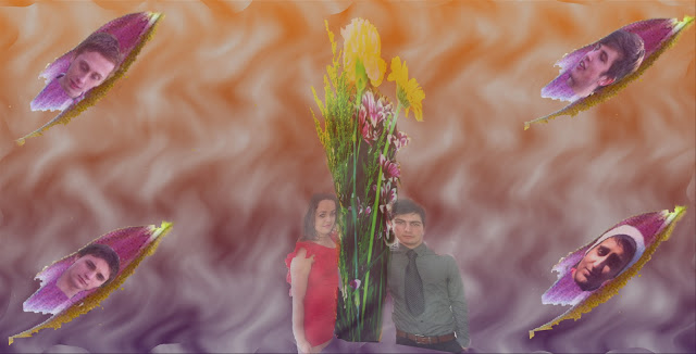
- For the inside panels of our digipak as well as having Sophie and Charlie layered in we have placed the boy bands heads, one in each petal which were placed in each corner. This clearly links are two narrative leads with the band, and also with the music video, which you can see below :
We Also Kept Some Things Different :
- The Mag Ad mainly includes, white colour font writing, compared to our Digipak where we used an equal amount of both, we did to begin with want to have the Mag Ad font colour White and the Digipak Black to try show a clear difference, however during planning this changed, as due to the background images some colours were more visible.
- Our first teaser of the Mag Ad was done in black and white, however we soon changed this for the real thing, and had it in colour. We chose to do the teaser in black and white, as we didn't want to show the full potential of the Mag Ad to audiences, as it was only a teaser.
As seen below you can clearly see the differences :
Teaser Final Draft
- The location between the digipak and the magazine advert are different, the Digipak being on the Moors and the Mag Advertisment being at the memorial in Ilkley. We chose the memorial, as it links to the idea of our lead girl being dead, which we discover at the end of the video.
- Also the Mag Ad is mainly focused on the band, so doesn't involved any of the narrative, so doesn't really tie in with the music video, compared to the digipak.
- The fonts style used on the digipak and magazine advert are different to each other, the N'SYNC is more bold on the Mag Ad compared to the digipak,however they are the same colours, the ' New Generation', on the Mag Ad is also more prominant and larger than what it is on the Digipak, with a more bold font, to make the name of the Digipak stand out more, also on the Mag advert this is placed in the colour of white, where as it is black on the digipak.
Evaluation Q3 - What Have You Learned From Your Audience Feedback?
N'SYNC were a major Boy band in the late 90's, when they released their first album, which was self-titled ' N'SYNC' in 1997, they became one of the most popular Boy bands of the teen pop and R&B genre. This meant that by the time they released their second album in 2000, their fan base had increased, with the majority being females ranging from the ages of 10 - 25. So based on this we decided due the baby faced image of N'SYNC in the 90's and the genre of music they were involved in, the primary audience would most probably been between the age range of 12 - 24, and the secondary audience being between the ages of 24 - 44 , as they would remember the songs from their childhood, also we decided that there could be a tween age 8-12, and possibly a homosexual audience.
In order to confirm our findings we conducted interviews with female and male teenagers our between 17 and 18 in order to see, what gender and age are most likely to remember songs from 90's Boy Band's and N'SYNC.
We showed 2 females Sophie Dixon and Katie Mallows and 2 males Harry Knight and Keiran Mitchell these pictures of 90's Boy Bands :

Here is on example of an interview we conducted :
Audience from Melodie Abraham on Vimeo.
Here is another interview we conducted with Sophie and Katie who are fellow pupils in our year :
From this we found out that, female were more prominent in remembering these 90's bands, which confirmed our thoughts on which gender our music video would be more appealing towards .. our answer was Females. Also from our research we discovered that bands such as Westlife, and N'SYNC were the most remembered, and had the most influence on people who were born in the 90's however mainly female. Where as Boyzone, Backstreet Boys, Five and Hanson were not as popular and remembered. When asked which music people would listen to still now most peoples answers were Westlife, showing they had the most influence in the 90's and now.
Doing this interview, helped us gain insight into how to attract an audience of this age range now, ideas included such as :
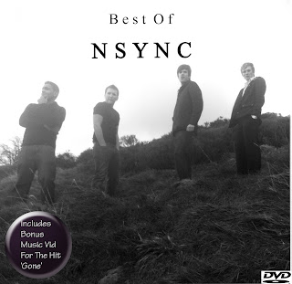
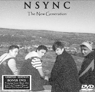
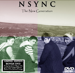


Feedback from our media teacher on the Digipak above, helped us come to the decision that this was going to be our final draft, we had all the basic features of a Digipak and as long as our inside showed some element of I.T Manipulation then the basic design of the front and back were completely fine. So the draft above ended up being our final draft, also as long as we could provide evidence as to why we chose black and white as you don't really see much of this, then we would be fine.
Inside of the digipak, took many planning stages as we could not grasp a certain idea, so we produced a first draft :
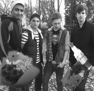
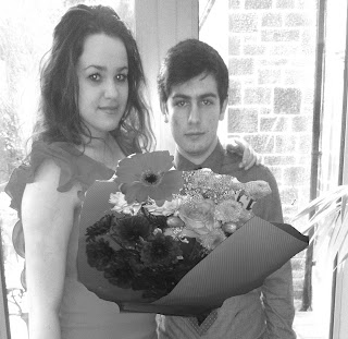
Feedback from this rough draft, stated that Sophie looked too out of proportion, as we had not shaped her correctly, by holding down the shift key when stretching in order to keep the image in proportion. Also the flowers were too feathered out you could tell what I had done, so they were not blended in enough, this was the same with the whisky bottle, due to us no longer having the whisky bottle in our music video, we had to take the whisky bottle out of our digipak. Also we did not have to have the inside black and white if we didn't want to.
After discussion with the class, a fellow media student Jess gave us the idea of having a rose spread along both panels, for the inside, and petals falling off it and maybe placing the heads of the band in the petals.
This feedback led to this final design of our inside. :
MAG AD
To begin with our mag ad had no real I.T manipulation which was bringing our marks down by a lot compared to the qaulity of our music video. When making our first draft it was a basic rough draft just trying to get to grips with an idea, and seeing what the band looked like, so we clearly knew before we even showed it to the class for audience feedback we had a lot of improvments to make.
FIRST.
This is the final magazine advert. I changed the font to the band name to make it stand out more and made the text stand out more.
If we had more experience with final cut we would try to make the magazine advert include more image manipulation.
In order to confirm our findings we conducted interviews with female and male teenagers our between 17 and 18 in order to see, what gender and age are most likely to remember songs from 90's Boy Band's and N'SYNC.
We showed 2 females Sophie Dixon and Katie Mallows and 2 males Harry Knight and Keiran Mitchell these pictures of 90's Boy Bands :
Here is on example of an interview we conducted :
Audience from Melodie Abraham on Vimeo.
Here is another interview we conducted with Sophie and Katie who are fellow pupils in our year :
From this we found out that, female were more prominent in remembering these 90's bands, which confirmed our thoughts on which gender our music video would be more appealing towards .. our answer was Females. Also from our research we discovered that bands such as Westlife, and N'SYNC were the most remembered, and had the most influence on people who were born in the 90's however mainly female. Where as Boyzone, Backstreet Boys, Five and Hanson were not as popular and remembered. When asked which music people would listen to still now most peoples answers were Westlife, showing they had the most influence in the 90's and now.
Doing this interview, helped us gain insight into how to attract an audience of this age range now, ideas included such as :
- Adding a modern touch to our band, by for example changing the clothing to be more modern and up to date, making the band members look more attractive, appealing more to a young teenage audience
- Also if sometimes you could cater to a homosexual audience, young, attractive males may introduce the ' pink pound theory '.
- Also by using attractive females in the music video, for our narrative we could be introducing the ' male gaze ' theory by Laura Mulvey. Which would make the female desirable and there for visual pleasure for the male, this could help make more males watch our video, decreasing the gender gap of audiences.
Music Video
In order to gain audience feedback for our music video, we filmed a variety of rough cuts, and placed them on social networking sites such as facebook, and online music forums, also Youtube and we also screen them to the class.
To begin with we created a 1.00 sample scene which was based on our narrative, in this sample we had the lead narrative male, also as the lead band member reminiscing on his relationship :
When we showed this to the class, we gained vital feedback which changed our music video completely in some way. Originally we were going to have the lead male vocalist, as the lead male in the narrative, however after feedback we decided to have the performance and the narrative separate, which then resulted in out next sample scene which included both performance and narrative seperate.
This sample scene was 1.13 it was a short sample where we wanted to test out our idea of having the narrative black and white and too see if the performance and narrative being separate actually worked better. The feedback we gained was :
- Members of our class said we had zero camera movement so this could be improved in our re-shoot of performance
- We need to re-rip MP3 and re-lay audio track
- We could start with a group shot and then individually introduce members of the band.
- For our mirror shot for the narrative, we could maybe play around with layering.
- Opening scene is maybe a bit to long for the narrative so cut this down a little bit.
- Overall we need faster paced editing, maybe some jump cuts.
- Bed shot - Multi layering and fade Sophie out.
- Additional behind the scenes footage of the band.
- Costumes more together, more white colours - white t-shirts etc, bringing the group together more by having them wear the same things.
- Simple Choreography for the boy band.
- Dont introduce boyband straight away.
- Dont need all of the shots of the main boy in narrative.
- More signifier of relationship needed for the narrative in misc-en-scene.
- For the narrative we could have Car Keys - bottle of drink to signify guilt maybe?
- Ducks and bread for a romantic scene in narrative.
- Do want some skin showing, not just buttoned up.
This feedback resulted in us making changes to cast due to one of them not taking the role of performance in the boy band seriously, which would effect our grade and video a lot. Due to the nature of the song the boy band had to take things seriously more often, and this was a major problem sometimes with certain members. Also our feedback made us play around more with the layering of Sophie and Charlie in the mirror shot. We also increased the pace of editing. We also came up with the idea of adding a whisky bottle to the narrative. This then led us on to produce our first full rough cut.
This rough cut, made us film all the performance again, we also included a duck scene in the narrative, as part of a flashback scene, which was to show the romance, we also included more layering of Sophie and Charlie, we tried to tie them more into the band so layered the band and Sophie and Charlie together more. We also included more shots of Charlie and Sophie together for the memories and flashbacks. We also had to include more shots of Sophie in order to avoid having a homosexual reading. Shots were shaky and jerky in some cases so we had to try and either re-film them or some how use the editing software to disguise the jerkiness.
We followed this and produced our 2nd rough cut.
After this we gained feedback that made us have a few minor changes to make, we still had to include more shots of Sophie by herself, so we included the kitchen scene, where Charlie turns around and he sees Sophie, he turns around again and she is '' gone " which links in with the title of the song. We also included a memory of Sophie trying on dresses for Charlie, we added this to try show more romance. We also instead of having the flashbacks black and white we used an effect called Vignette, and once again layered in more of the band. We also shorted the ending and made the band more clearer at the end. We sorted out shaky shots. After we did all of this we produced our final cut!.
Over all feedback was from many different audiences, the main positives were :
- There was a lot of shot variation, which kept the audience entertained.
- The effects used added a more professional look to our video, our effects were a vital part in our music video as our basis was flashbacks.
- Some shots were liked by a lot of people, certain shots included layering where one member of the boy band, is layered into the flashback and looks at the couple.
Digipak
When doing our Digipak we picked our favourite pictures, and then went on to design our first front digipak :

After feedback, we changed the name of the Digipak, from ' Best Of ' to ' New Generation ' and changed the front image due to us changing then name of the band. This then led to our second draft our Digipak which included the new band.

For this one we used a blizzard effect, after feedback from our media teacher we decided to change this effect and try a different one.

Feedback from this draft, made us realise that the front and back could just be simple pictures as long as there is a connection between the two, which lead us to designing our final draft.


Feedback from our media teacher on the Digipak above, helped us come to the decision that this was going to be our final draft, we had all the basic features of a Digipak and as long as our inside showed some element of I.T Manipulation then the basic design of the front and back were completely fine. So the draft above ended up being our final draft, also as long as we could provide evidence as to why we chose black and white as you don't really see much of this, then we would be fine.
Inside of the digipak, took many planning stages as we could not grasp a certain idea, so we produced a first draft :


Feedback from this rough draft, stated that Sophie looked too out of proportion, as we had not shaped her correctly, by holding down the shift key when stretching in order to keep the image in proportion. Also the flowers were too feathered out you could tell what I had done, so they were not blended in enough, this was the same with the whisky bottle, due to us no longer having the whisky bottle in our music video, we had to take the whisky bottle out of our digipak. Also we did not have to have the inside black and white if we didn't want to.
After discussion with the class, a fellow media student Jess gave us the idea of having a rose spread along both panels, for the inside, and petals falling off it and maybe placing the heads of the band in the petals.
This feedback led to this final design of our inside. :

MAG AD
To begin with our mag ad had no real I.T manipulation which was bringing our marks down by a lot compared to the qaulity of our music video. When making our first draft it was a basic rough draft just trying to get to grips with an idea, and seeing what the band looked like, so we clearly knew before we even showed it to the class for audience feedback we had a lot of improvments to make.
FIRST.
Feedback we gained from this was that we needed more I.T manipulation for example layering as we had none at all, and I.T manipulation is a major part of a mag ad. We also had to play around more with the fonts and colours for variation, we needed to include more about the Digipak as that was the main focus of our Mag Ad. We needed to change our ' available on ' from cd/digipak, to Digipak CD as they are the same things. This led to our next attempt :
Again feedback from friends, media teacher and our fellow media students, told us we needed more I.T manipulation. We got told the NSYNC needed to be more apparent and visible. We needed to include social networking icons, eg facebook and twitter. We also got given a different idea, which meant we would include I.T manipulation. The new idea was to have a younger generation looking forward with their back to us, like our digipak back panel, and then have the band layered in, maybe as their reflection. This then led to our a near final draft :
This is our 2nd draft. It shows our new idea of having a younger group of fashionable boys looking/ admiring at older boy band, then showing boy band behind. We didn't end up placing the boy band behind because we were not able to re-shoot with the band, so we layer the faces into the frame. We also used the lines created by the bench to write our text.


If we had more experience with final cut we would try to make the magazine advert include more image manipulation.
Audience feedback played a great part when we were doing this coursework, our music video took a lot of time, and with out the feedback we would never have known what to include in order to attract a teenage audience if we had not conducted our interviews with males and females in our school. We couldn't of achieved the best we had done, if we had not gained feedback by creating sample scenes and rough cuts. Although we have done this coursework ourselves, our main concern was the audience, if the audience did not like it then, our video would not have been a hit.
Evaluation Q4 - How did you use new media technologies in the construction and research, planning and evaluation stages?
Research And Planning
In the Research and Planning stage, I came across many different technologies when looking into my band, N'sync. Most of them however were internet based.
The main new media technology I used during the whole coursework would be Blogger, this was our main place where we would blog about our research into our band, all the band information would be found here.
In order to record all our research and planning I created a blog. A blog is an online portfolio, which you can access both at home and at school, this allowed us to present all stages of our coursework, updating it on a daily or weekly basis. With blogger we also created a production blog for our production company ' Mellie productions' we came up with 'Mellie' by putting both our names together.
The production blog was mostly focused around the production of our music video, so it mainly included a filming schedule and updates on casting and shoots. Blogger is also easily accessible, and can be found by certain Google searches, therefore widening the audience of who will view your blog, allowing you to gain more audience feedback. Blogger is also a good and quick way for our media teacher to access a look at our work so far without, as he created a blog aswell, meaning we can simply ask any questions if needs without being at school. Having a blog in which your teacher can gain looks at by having your own url, again increases chances of audience feedback, more quickly and efficiently as you are able to comment on each others post when they have been published. Also with me working with Melodie Abraham, it meant I could keep up to date with work she was doing on her blog as part of our Research and Planning as we often split the research into two, and shared the blog posts, this saved us a lot of time, we titled the post with each others initials meaning we could share the posts.
Blogger also enable you to embed videos from sites such as YouTube and Vimeo so people can then view videos via your blog, meaning we can place rough cuts of our music video on our blog, and again with the fact people can view this and just write a comment makes it a very simple and quick way to gain audience feedback.
I have embedded many videos from youtube on to my blog, as seen here I have embedded by 2nd rough cut onto my blog using Youtube, http://a2vid2012-ellief.blogspot.co.uk/2012/04/nsync-gone-rough-cut-2.html, I also before the course fully started over summer I embedded plenty of music videos, when researching them an example you can see here : http://a2vid2012-ellief.blogspot.co.uk/2011/09/say-my-name-destinys-child.html.
When Embedding a code onto your blog, your post will look like this to begin with :
Another way Blogger is useful, is that you can in put hyper links which is always useful when trying to show in a post maybe where you gained your information, a hyper link is a direct link which you can place in your post, and it will take you or the person looking at that certain blog, straight to the source, or in some cases to a youtube page to show a video, if some videos will not embed.
Hyper links are also a useful thing to have in a links section on your blog, if your researching boy bands like we were, you can place links in there which take you directly to an article maybe about the band. In order to place a link in to the post you simply go to the' link ' icon at the top of
the page and then copy and paste your link into the link box, you can then simply rename your link.
Another technology I used was Vimeo, this is a website used for uploading videos, to a little bit like YouTube however less popular, we used this mainly in class time at school, as YouTube is banned, so this site became very handy when wanting to upload and embed sample scenes or rough cuts, quickly at school for audience feedback .
Vimeo works similar to youtube, once you have uploaded your video, you then collect the embed code and copy and paste it into blogger.
You Tube was used very regularly by us and many other media students, it is an essential website of technology as it entitled us to be able to have our own You Tube pages in order for us to upload all our sample scenes and rough cuts ourselves, with out waiting for our media teacher to upload them on to the IGS Media Studies page. This IGS Media page is a great way of us all being able to view each others music videos, and give them feedback by posting comments under the video, in the comments box.
You tube aloud us to watch videos, from home, when researching our genre we were able to watch previous music videos, from N'SYNC or other 90's boy bands such as Westlife, helping us look closely at the common conventions needed when making a boy band music video, rather than just seeing it in writing form, from websites such as Wikipedia. Also You tube has pages for certain artists, with a list and links to their videos, only making it easier when trying to find videos for N'SYNC. Not only did it do this, it also gave us lists of albums released by N'SYNC and what songs were included on them, also it gave us lists of related artists and their music videos, which helped us when researching the 90's.
Below is an example of an N'SYNC video taken from You Tube :
Another technology I used is Scribd, this is a social publishing site, where you can share word documents and writings.
Scribd was always useful, for when we wanted to upload writing documents, for example call sheets, story boards, and our treatment. We could not just straight away put them on do blogger with them being word documents, so we had to scan them using the scanner provided by media, and then upload them onto Scribd and then like we do with You tube and Vimeo we then copy and pasted the embedded code into Blogger.
An example of a document put on Blogger by Scribd is here :
In order to upload our footage onto final cut we first of all had to import in onto I Movie, and then export the clips to Final Cut. These were the main two programmes used in the editing process for our music video.
Final Cut allows you to add more effects and transitions between clips, compared to IMovie. In Final Cut it allows you to extract audio from clips, so when editing the audio can be taken away so anything you do not want in you can take out of the background noise of the shot. Final cut allowed us to put in layering effects and decrease and increases something called the opacity, which we used a lot in our music video, with our main theme being flashbacks.
Also when doing a Pod Cast, and say if the voice recorder is in use, then we will be able to use a video camera, which would then mean we had to extract the audio, in order for it to be a podcast, so extracting the audience came in great handy.
Final Cut allowed us to cut clips in half, so we could split clips and put them in different places. Final cut then allowed us to export our files to a quick time file, which we would then pass on to our teacher for feedback.
Another useful technology you can use is Div Share, this is again a music sharing website for uploading files, this was mainly used for uploading our podcasts, and also uploading our MP3 to put on our blog. After using the voice recorder for our podcasts we upload the files to DIV share, after converting it to an MP3 file, you then again get the embed code and place it on your blog.
In order to actually produce and film the footage we used a HD camera, which were new to A2 from AS. This camera gave us a better quality of footage, compared to what we would of got from using the camera from last year, which was not a HD one.
In order to keep our shots steady, so we don't run the risk of having a shaky camera, we used a tripod, we used a tripod last year making it very easy to use for us, so this made things go quicker when filming. Even though this was only a piece of equipment not a technology it was still vital to our coursework, as would of had a lot of ' jerky ' shots if we had not used this piece of equipment.
To create our Digipak and Magazine Ad we used Photoshop, unfortunately for us we could not use the Photoshop on the apple mac, so we had to switch to windows and use Photoshop on there, meaning our Photoshop was different to other groups. Photoshop allowed us to edit our images, and change the colour easily, meaning we could change our front and back panel images to grey scale ( black and white ) instead of RGB colour, we used RGB colour for our Mag Advert.
Photoshop allowed us to add text to our image, with a variety of fonts and colours to choose from. Also it allowed us to play around with effects, on our images for example an earlier draft we produced included a Qaudrant effect :

It helped us come up with our final digipak, by using the border effect on the front and back :


It also enabled us to play around with the lighting, colouring and brightness of our images. It also meant we could crop, the heads of our boy band for our boy band and play around with the opacity making them blend in more. Compared to our first draft you can see the difference when we played around with the design :
First Draft Final Draft
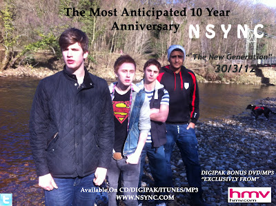
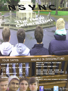
As you can see Photoshop helped us make a better quality magazine add, which resulted in our final draft.
Finally another useful piece of technology used is ' Grab ' it enable you to print screens, take screen shots of your work in order to show what you have done, just like I have when showing what an embedded code looked like, or a link or showing what Vimeo looks like, I used ' Grab ' to enable me to do that. It also means you can screen shot, part of an actual website meaning you do not have to copy and paste, and it make the post less wordy, if you place images in. ' Grab ' also came in handy when I wanted to evidence the emails between me and the record company when asking for permission. Which you can see here > http://a2vid2012-ellief.blogspot.co.uk/2012/02/ef-contacting-record-company_08.html.
Sunday, 29 April 2012
MAG AD - FINAL DRAFT

Here we have changed the font of N'SYNC so it stands out more, also we have changed the names of the arena of which we put on for our tour dates.
MAG AD - Near to Final Draft
Mag Ad
This is the final draft of our Mag Ad. We have chosen to this in colour, different to the digipak being in black and white. We have tried to have a younger generation with their backs to us, and layered in faces of our band members. We have used the bench as a frame work for our writing, which we thought worked well. The pictures were taken on a different day to filming, which is why the location is different.
This is the final draft of our Mag Ad. We have chosen to this in colour, different to the digipak being in black and white. We have tried to have a younger generation with their backs to us, and layered in faces of our band members. We have used the bench as a frame work for our writing, which we thought worked well. The pictures were taken on a different day to filming, which is why the location is different.
Final Digipak
Here is the final version of our Digipak.
Inside Panels
The inside consists of 2 panels which have a marble effect background in colour which contrasts to our front and back panels as they are in black and white. We took a picture of some flowers which we bought ourselves, from many different angles until we had the correct one, we then uploaded this image into Photoshop, I then edited it by cropping out the back ground, which left me with the flower only, I then used the eraser tool to feather out the rest of the flower I didn't want. I also decreased the opacity to around 70% to make it blend in more with the background. I then took a picture of Sophie And Charley the lead male and female from our narrative, wearing the same clothes as a scene from our narrative where they are going out for a date in a flashback, I then again cropped out parts I did not need and decreased the opacity to around 50% and placed them either side of the flowers in the middle of the panels. Finally we took pictures of the petals from the flowers, I enlarged the pictures on Photoshop, and placed one petal in each of the corners, of the panels which resulted in four petals, which meant we could then place the heads of the band members into the panels, again decreasing the opacity, and re-sizing and cropping the heads.
Front Panel
The front panel is an image of the band for the background on the bench in the location of Ilkley Moors, which was a location used in our music video, the pictures for the digipak were taken on shoot, when filming our performance footage. It is in black and white, as we wanted to try make it similar to our narrative being in black and white, also we wanted it to be different to the original N'SYNC digipak for ' gone '.
Back Panel
The back panel is in the same location, however it is simply them looking towards the moors, rather than them looking at us. This is a clear link between the front and back panels, which is a typical convention of a digipak. We have included our own QR code which is a direct link to our production company blog, which is also a good feature, we have also put websites on for N'SYNC websites.
The Spine
Below is our spine for the digipak, we tried to make this simple, using the border effect we have used on our Digipak front and back panels, we have also used a confetti effect from Photoshop for the writing.
Subscribe to:
Posts (Atom)


